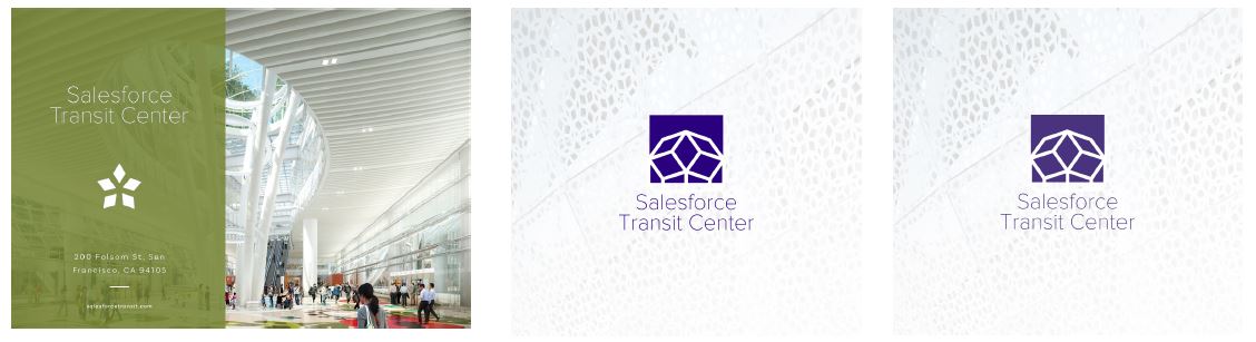
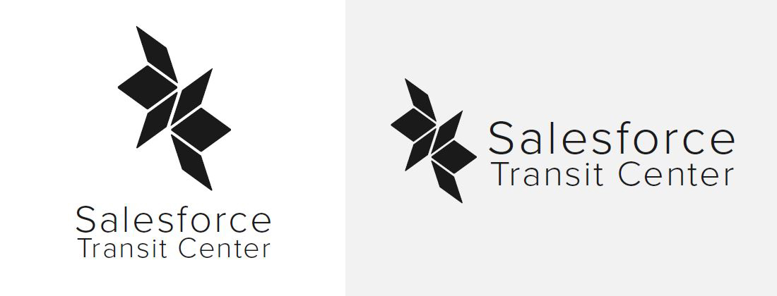
Salesforce Transit Center looks unlike anything you’ve seen before. The new, high tech, San Francisco Bay Area landmark is an innovative, sustainable building that transforms a transportation hub into an urban experience, complete with a gondola, and topped off by a four-block-long rooftop park open to the sky.
Mood Board
Based on the responses to the Salesforce Transit Center brand questionnaire, these associated keywords and images encapsulate the essential qualities and ambiance of the Salesforce Transit Center.

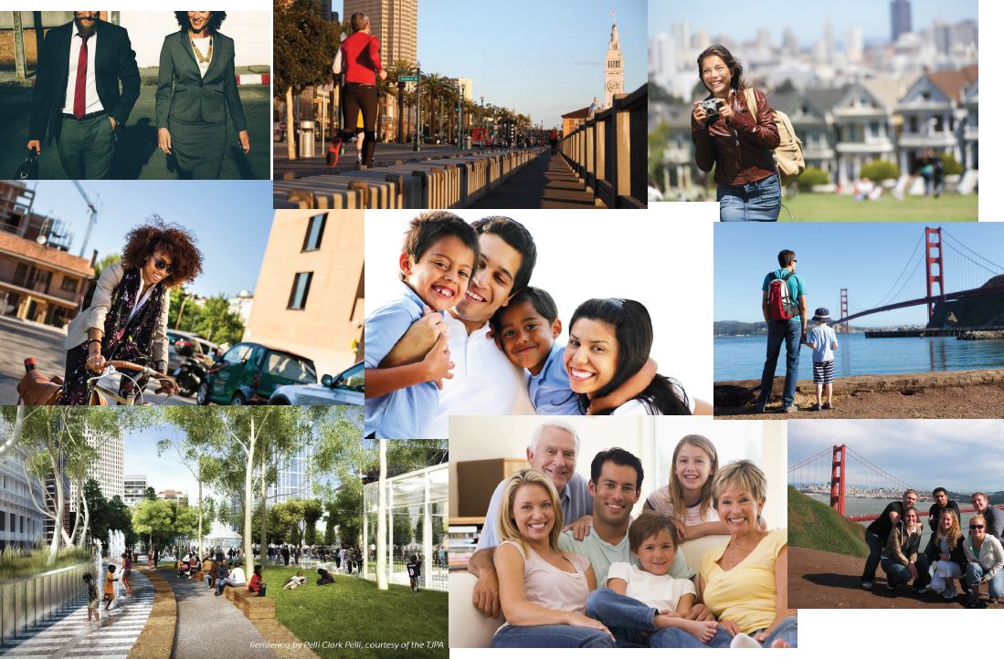
Audience / Lifestyle
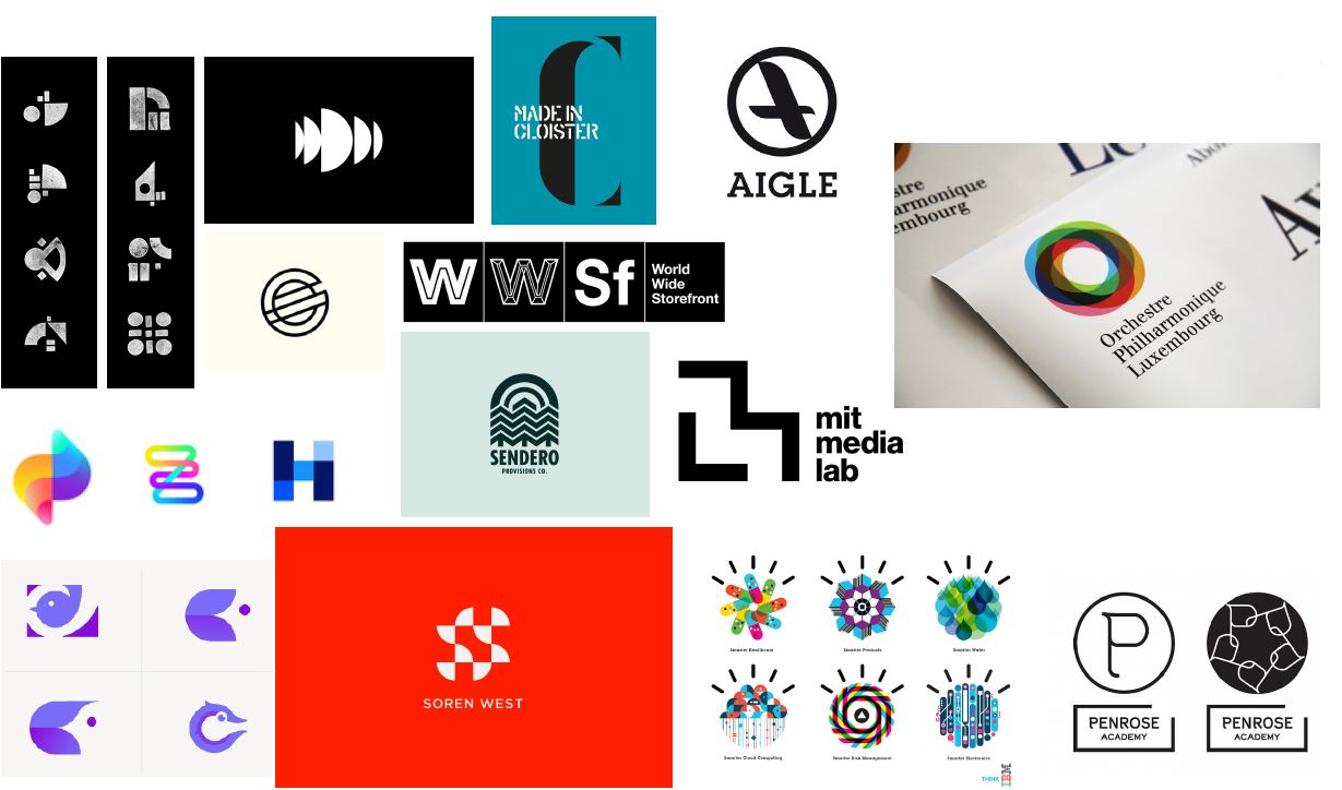
Logo Inspiration
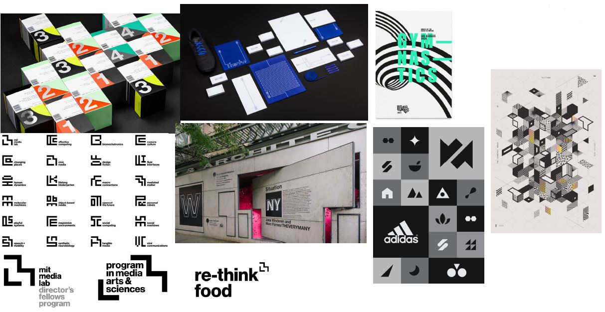
Visual Systems
Concept
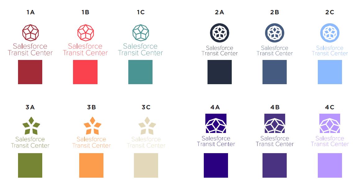
Inspired by the Penrose rhombus, the concept mark represents both Salesforce Park as a sustainable urban oasis and Salesforce Transit Center for its transportation lines, with negative space indicating access and connectivity to surrounding neighborhoods and streets. The color palette matches Grand Hall artwork and Salesforce brand guidelines.
Color Palette
Variations of the color palette are selectively matched with Grand Hall colors and Salesforce brand guidelines.

The Bottom of the Iceberg
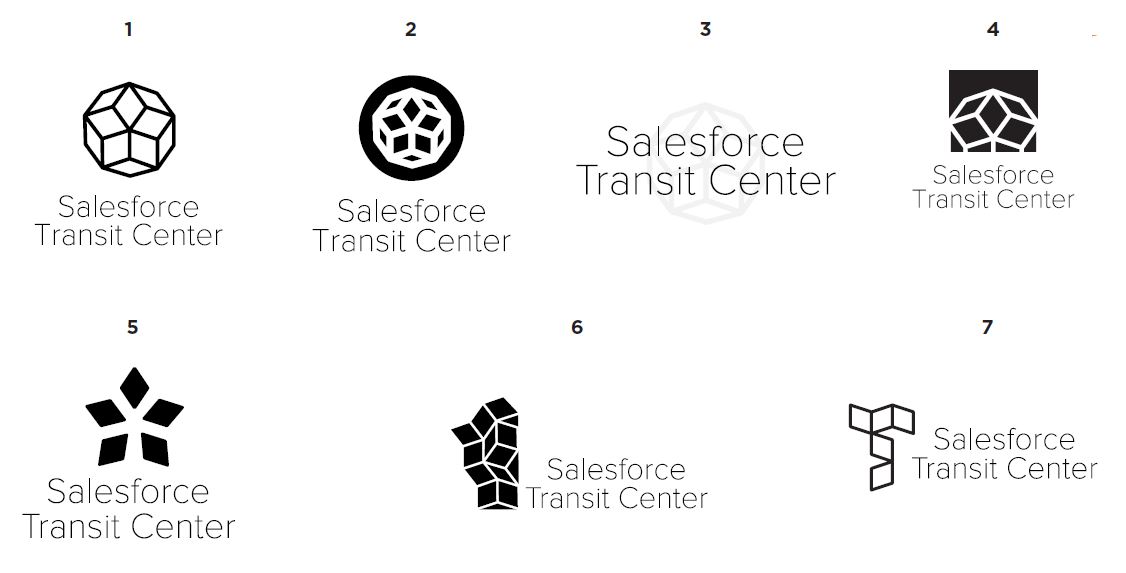
More Logo Research & Penrose Variations
Based on Penrose awning structure
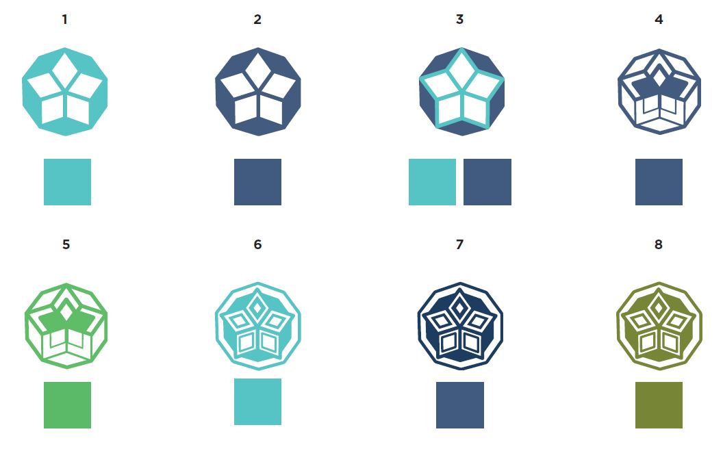
Color Palette Options
Based on Grand Hall design colors
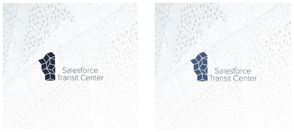
Web Usage / Web Banner

Presentation / Business Usage