Visual Style Ideation
1. Indie Approach
Through bold color, typography and long-cast shadows, this style achieves eye-catching visuals for slides, posters, invitations, and advertisements. The clear, bold nature of this style will allow us to clearly communicate and convey information in a simple, straightforward way. Simplicity here is key. It’s all about giving the audience of every piece of collateral in an easy-to-digest way that sticks with them long after they stop looking.
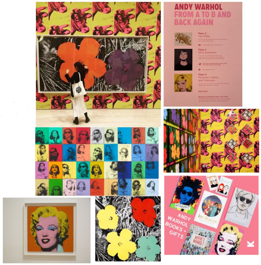
2. Andy Warhol
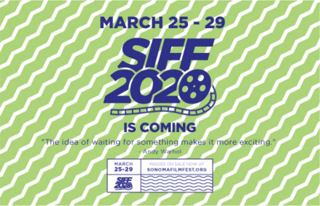
‘Andy Warhol’ concept stemming from the ‘See Warhol, Meet Andy’ exhibition at the SFMOMA.
Concept Mockups
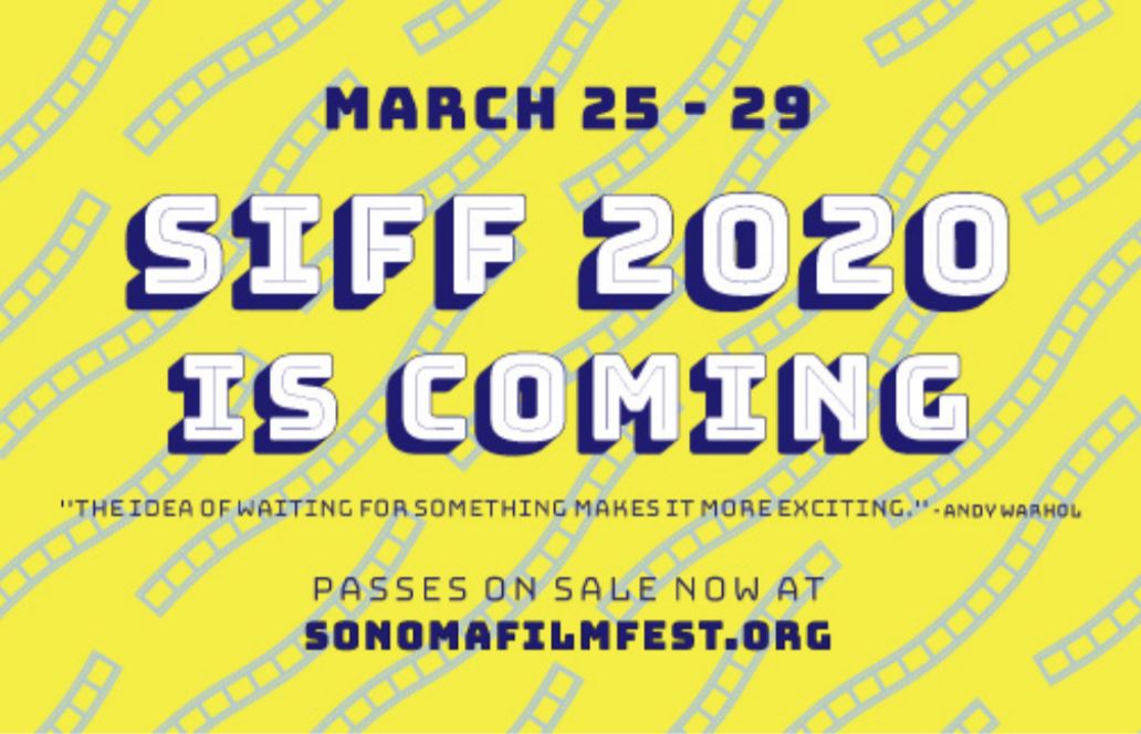
01. Uses bold type in contrasting styles to display information clearly. Using the background as an opportunity to use a film strip texture, giving the audience a clear idea of what SIFF is all about.
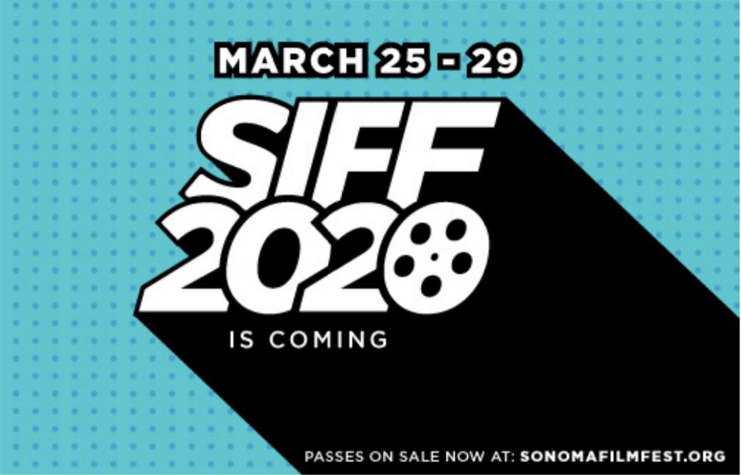
02. Similar to concept 01, but with a lot of attention drawn to the event title. We gave the logo a new look to match the overall aesthetic of this pop art style. We also gave the green and purple color scheme a refresh.
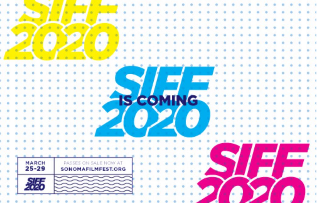
03. An abstract take that breaks away from the basic grid and “frame”. Having the elements bleed o the image implies there’s more to the event, and brings some mystery to what people can expect this year.
04. This one is all about using simple shapes to draw the eye into the piece and give the text dimension. The projection of the SIFF text makes a “spotlight” for the message. Simple texture in the background creates interest and subtle depth.
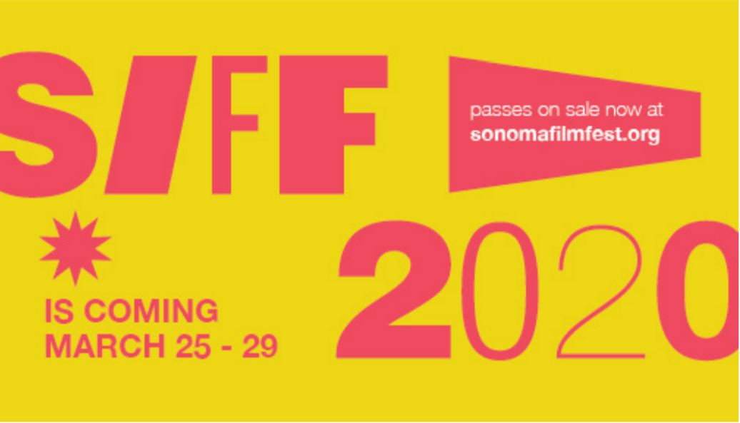
05. Inspired by the use of bright primary colors as seen in Warhol’s work. The use of experimental type is used to create hierarchy and texture. The use of shapes will represent SIFF and act as call to actions.
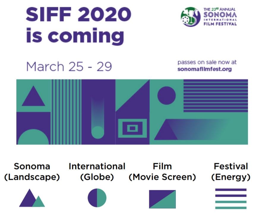
06. Minimalistic with a touch of retro, this concept uses geometric shapes representing the Sonoma International Film Festival. The shapes can be used to create patterns to highlight events within the festival.